Space4Earth
A geospatial platform that turns free satellite data into operational answers, from a pixel to "irrigate this parcel this week" or "this slope is accelerating." It started as agronomy and grew into nine verticals on one shared core. No LLM here: it's remote sensing, GIS, image processing, and a cloud analysis pipeline, wired to live official open data. The build that proves the toolbox goes wider than AI.
Satellite data is free and abundant; a decision is not. Between a Sentinel-2 tile and "this field is water-stressed, irrigate the north third" sit a dozen unglamorous problems: which pixels are cloud, where the field actually ends versus the road next to it, which cadastral parcel this even is, and how to turn a vegetation index into a number a farmer acts on, without downloading half of Europe first.
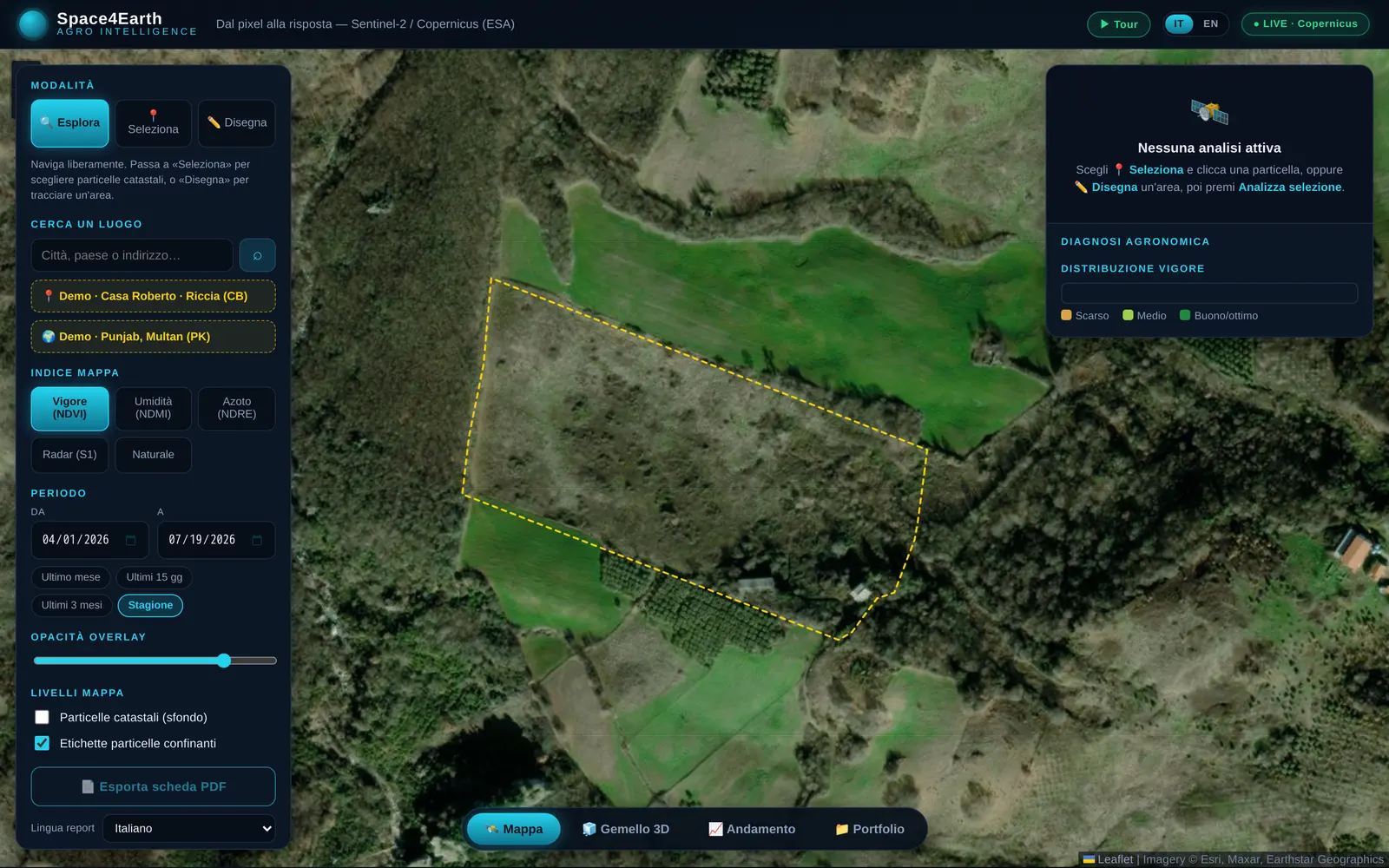
Space4Earth is the pipeline that closes that gap, "from pixel to answer." You click a point on the map; it resolves the real parcel from the official land registry, pulls only the imagery it needs, computes the indices, and hands back KPIs, a 3D view, and a recommended action.
> dual-mode: the whole chain runs on mock data out of the box, and switches to live ESA imagery the moment you add (free) credentials.
It began as agronomy. Every vertical since has been a different question asked of the same three engines, which is the whole point: the expensive part is the pipeline, not the use case. Each one is a shareable URL with a worked example already loaded.
Ground movement from InSAR. Four verticals read the same displacement time series and ask different questions of it.
Landslide early warning on a national semaphore. Petacciato runs on real EGMS persistent scatterers, 2019 to 2023, with converging inverse-velocity and the A14 and railway assets in the corridor.
The same deformation, aimed at bridges, embankments and rail. An asset is a geometry with a movement history attached.
A per-building satellite passport: what the ground under this specific footprint has been doing.
Risk scoring before the policy, damage verification after the event, from the same series.
On-demand imagery for one geometry, with the index computed by evalscript at the source. Optical, radar and atmospheric, depending on the question.
The original: diagnosis, prescription and crop planning from Sentinel-2 and -1.
Rapid mapping on Sentinel-1, which sees through cloud on the day it matters. Worked events: Indus 2022, Emilia 2023, Valencia 2024.
Water and air on separate sensors: chlorophyll from Sentinel-2 over Trasimeno, NO₂ and CH₄ from Sentinel-5P.
Cannabis sativa screening by spectral angle mapping, against a real Sentinel-2 signature and a real EMIT hyperspectral one, 285 bands, from NASA. It screens land, never people.
No satellite tasking at all. Terrain, soil, climate and host species, combined into a suitability surface.
Truffle ground potential for white T. magnatum and black T. melanosporum, from DEM morphology, SoilGrids, NASA POWER climatology and OpenStreetMap woodland. It maps habitat to point the dogs at, and does not claim to find the truffle.
Analysis follows the question
No bulk ingest. Click a point and the app pulls the real cadastral parcel from the land registry over WFS, then requests Sentinel-2 imagery for that one geometry, on demand. It scales to a whole region without ever pre-downloading it, because the pipeline only computes what someone actually asked about.
The field draws its own boundary
A cadastral polygon isn't the crop, it includes roads, headlands, and tillage. So the perimeter is derived from the imagery itself: region-growing on NDVI to separate the crop, Moore boundary-tracing to walk the edge, RDP to simplify it. The indices are then computed on the real field, not a rough box around it.
Cloud-aware, or it lies
A phenological NDVI/NDMI curve is worthless if a cloud reads as a dead crop. Every scene is masked with the Sentinel-2 SCL band before it enters the time series, so the seasonal trend tracks the plant, not the weather. Getting the boring parts right is what makes the pretty chart trustworthy.
Pixel to answer, not pixel to map
The output is a decision, not a heatmap. Indices become KPIs a farm cares about, mean vigour, percent under water stress, estimated water saved in cubic metres and euros, then a recommended action (targeted irrigation, variable-rate nitrogen, inspection). A 3D twin extrudes each cell by vigour, and it all exports to a per-parcel PDF.
Two weak signals, and the confusion published
Spectral angle alone flagged hemp correctly and rice along with it: six test areas, recall 1.0, precision 0.33. Crops that look alike in ten bands stop looking alike over a season, so a phenology test was added on top, and precision went to 0.5 with recall held. Still imperfect, and maize is still a confuser. That caveat ships with the number, because a validation you can't see the failures of isn't one.
The claim that would have sold better
"Find truffles from orbit" was the demo everyone wanted. The research said no: the fruiting body sits under 5 to 30 cm of soil, and no optical sensor sees it. The tempting fallback, that truffle soil maps onto free global soil data, failed adversarial review too, since the decisive variable is active carbonates and the free products don't carry it. So the vertical shipped as what it can honestly be, a habitat suitability map that tells you where to walk the dogs.
Space4Earth is here to make one point: the pipeline thinking doesn't stop at web apps and LLMs. Remote sensing, GIS, image processing, integrating a live government open-data service, these are the same muscles, aimed at a satellite instead of a database. If your hard problem lives in geospatial or sensor data, I can build the pipeline that turns it into an answer. Let's talk.